
Building a genomic marketplace brand and digital presence from scratch
Industry:
Biotechnology
2017-2018
Timeline:
Role:
Lead Designer
Responsibilities:
Branding, Website Design
NEBULA GENOMICS
Intro
Nebula Genomics was an early-stage genomics and blockchain company focused on creating a decentralized marketplace where individuals could securely own, control, and participate in the value exchange of their genomic data.
As the company prepared to enter a rapidly evolving and highly trust-sensitive market, there was a need to establish a cohesive brand identity and digital presence that could communicate complex scientific and technical concepts in a way that felt credible, accessible, and forward-thinking.
As Lead Designer, I helped define the visual identity system, digital foundation, and website experience that positioned Nebula as an emerging leader in genomic data ownership and decentralized health technology.
Business Challenge
Project Goals
My Role
Nebula’s proposition brought together genomic sequencing, blockchain infrastructure, personal data ownership and decentralized marketplace. These concepts were unfamiliar to many audiences and raised important questions about privacy, security, credibility and control.
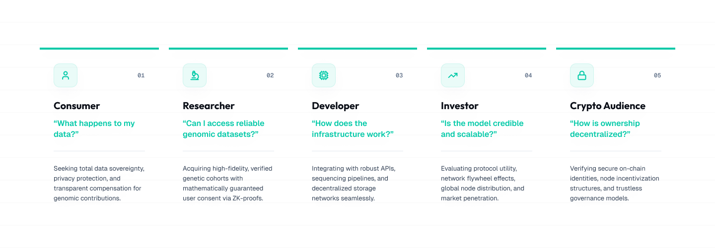
The experience needed to balance scientific credibility and technological innovation without becoming clinical, speculative or inaccessible. It also needed to communicate effectively with several audiences, such as consumers, investors, developers, researchers, and crypto-native audiences, each with different expectations and levels of technical knowledge.
In addition to establishing legitimacy within an emerging market, the company also needed a digital foundation capable of supporting long-term scalability, evolving product offerings and a growing ecosystem.
The challenge therefore extended beyond creating a logo and a marketing site. The goal was to translate a complex and highly technical vision into a clear, trustworthy, and scalable digital experience that could support both the company’s launch and future growth.
The engagement focused on establishing a credible brand, making Nebula’s proposition easier to understand and creating a digital foundation that could evolve with the business.
The website also needed to encourage consumers to join the sequencing waitlist, communicate legitimacy to investors and partners, and provide a consistent visual system that could later extend into products, portals and educational content.
As a lead designer at the agency, I guided the visual and digital direction from early discovery through final delivery. I facilitated brand discovery, reviewed the competitive landscape, created moodboards and visual territories, explored and refined the logo, defined the color and typography system, established the website architecture and produced responsive wireframes and high-fidelity designs. I collaborated with client stakeholders and the wider agency team throughout the project, such as a creative director, marketing strategist, copywriter, and developer.
Discovery and Stakeholder Alignment
The project began with a structured questionnaire and stakeholder conversations designed to clarify Nebula’s mission, personality, audiences and long-term ambitions.
We explored questions such as:
What was the story behind the Nebula name?
How did the company want to be perceived?
What role should trust and transparency play in the brand?
Which audiences needed to understand the proposition first?
How should Nebula differ from other established companies?
How could identity communicate innovation without feeling speculative?
What should people feel when considering participation in the marketplace?
This process helped move the conversation beyond subjective visual preferences and establish shared criteria for evaluating future design directions.
Key themes that emerged
Trust was foundational
Because Nebula was asking people to think differently about highly sensitive genomic data, the brand needed to communicate responsibility, transparency and legitimacy from the first interaction.
The technology needed to feel understandable
Blockchain and genomic sequencing could not dominate the story. The experience needed to lead with human value before introducing the underlying technical infrastructure.
The brand had to serve multiple audiences
The identity needed to feel accessible to consumers while retaining enough authority for researchers, investors, developers and strategic partners.
The system needed to scale
The company’s initial website was only one part of a larger future ecosystem. The visual language needed to support future portals, products, tools and educational content.
Understanding the Industry Landscape
Before defining the visual identity and website experience, I reviewed the broader genomics, health-technology and blockchain landscape.
Many genomics companies relied on clinical palettes, literal DNA imagery and institutional typography. These choices communicated authority but often felt cold or difficult to distinguish from traditional healthcare brands.
Blockchain companies frequently used darker interfaces, abstract networks and highly technical language. Although these conventions suggested innovation, they could also feel speculative or intimidating to broader audiences.
Nebula needed to occupy a space between these categories: scientifically credible and technologically progressive, while remaining understandable, transparent and human.
The audit included companies such as Doc.ai, LunaDNA, Edico Genome, 23andMe and DNAnexus. It helped identify an opportunity to move beyond predictable DNA imagery, lead with personal ownership and make the wider ecosystem easier to understand.
This research helped shape the brand’s tone, positioning and broader digital direction.
Defining the Brand Direction
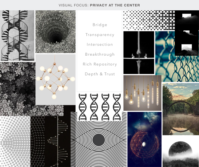
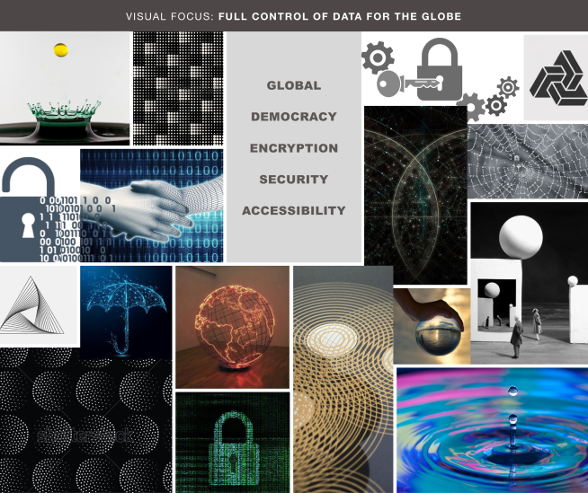
Following discovery and landscape research, I worked closely with stakeholders to define a visual direction aligned with Nebula’s mission, audience expectations and long-term positioning goals. The brand needed to communicate innovation and technological advancement without feeling cold, speculative or inaccessible. At the same time, it needed to establish legitimacy within a space associated with privacy concerns, sensitive personal information and emerging technologies. Moodboards and visual explorations were used collaboratively to evaluate several tonal directions, ranging from highly technical and futuristic to more human-centred and approachable systems. This allowed the team to discuss the emotional and strategic implications of each direction before committing to detailed identity design.
Brand principles
Four principles guided the identity and digital experience.
Credible
The brand needed to feel appropriate for a company handling sensitive genomic and health information.
Progressive
The identity needed to signal that Nebula was introducing a new model for genomic ownership and exchange.
Transparent
The visual language and website communication needed to support clarity, openness and individual control.
Human
Although the underlying technology was complex, the brand ultimately needed to communicate value to people rather than only technical specialists.
Designing for Emerging Technology
Trust influenced more than the visual style, it also shaped the content hierarchy, terminology and sequence in which information was introduced. Visitors needed to understand what Nebula was, why genomic ownership mattered, who controlled the information, how the data exchange worked and why the company was credible before being asked to participate. The website therefore introduced the broader mission and individual value first, followed by the marketplace model and supporting technology. Blockchain was presented as infrastructure supporting ownership and exchange rather than being the main story. Trust was reinforced through clear language, consistent terminology, visible partnership, structured explanation and repeat emphasis on personal control and transparency.
Logo
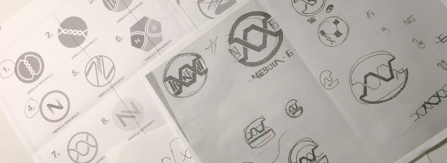
With the brand principles established, I began a broad exploration of visual concepts.
Initial sketches investigated themes related to genomic systems, connectivity, data exchange, ownership, decentralized networks, the letter “N” and celestial forms associated with the Nebula name.
The strongest concepts were evaluated based on relevance, distinctiveness, scalability and their ability to work across different digital and physical applications.
Rather than moving directly into polished artwork, the process began with breadth and gradually narrowed toward the direction that best reflected the company’s positioning.
Logo Refinement
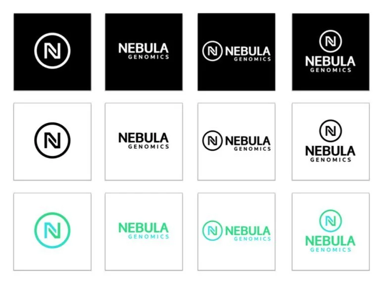
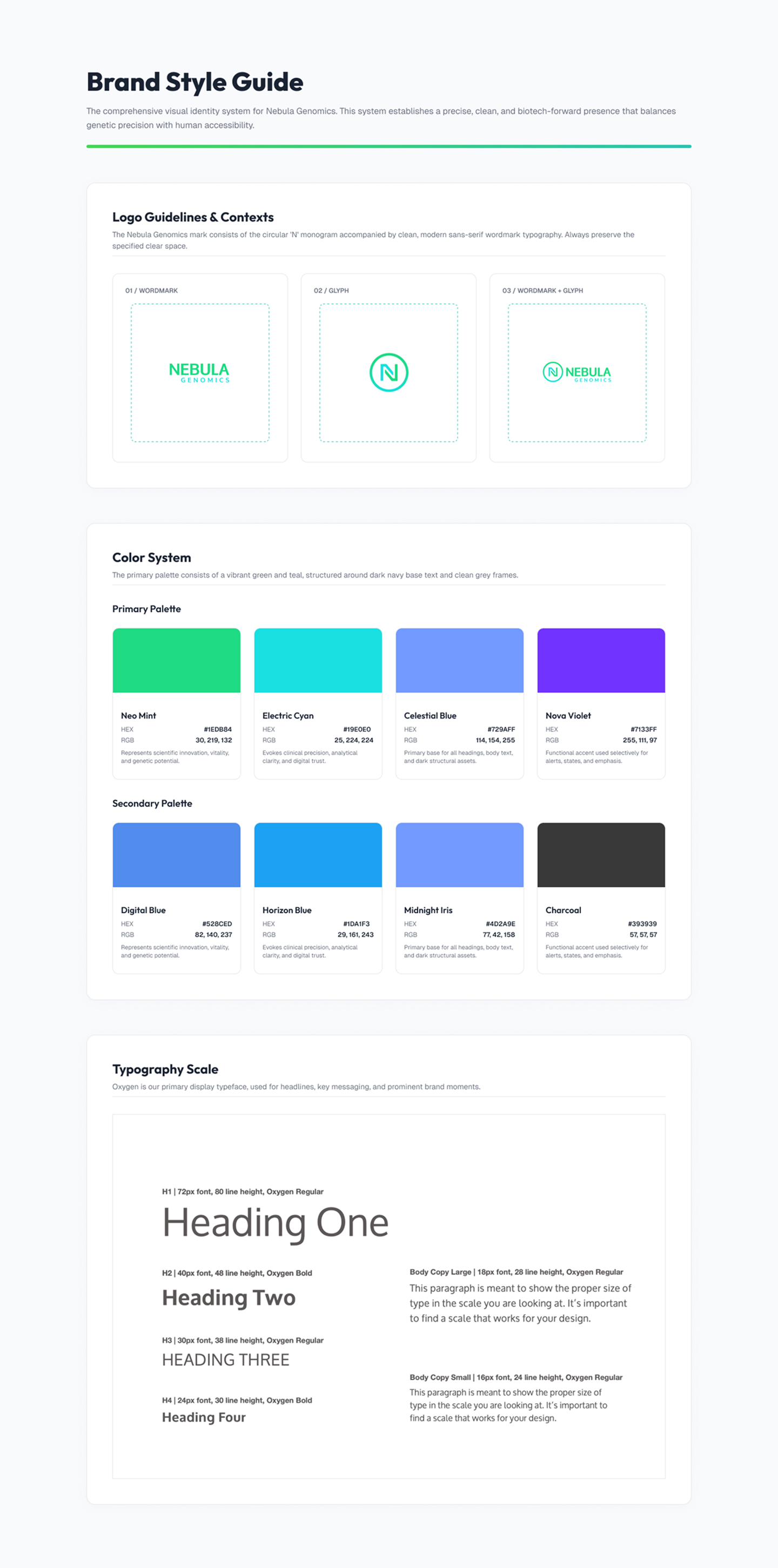
After selecting the strongest direction, I refined the symbol through repeated adjustments to its geometry, proportions, spacing and visual balance. The final explanation must describe what the symbol genuinely represents. The final mark combines an abstract “N” with a connected circular form representing the relationship between individuals, genomic information and the wider data ecosystem. The identity was developed in black and white before colour was introduced, ensuring that the mark remained recognizable based on form alone. I then explored horizontal, stacked, symbol-only and wordmark-only configurations to confirm that the identity could work across website headers, social platforms, presentations and future product interfaces.
Formal audience testing was not conducted within the scope of the engagement. Concepts were reviewed with stakeholders and tested across different sizes, backgrounds and applications to evaluate legibility and flexibility.
Visual Identity System
Once the logo was finalized, I expanded it into a broader visual system that could create consistency across the website, social channels, presentations and future products.
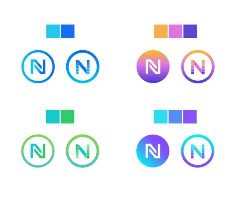
The selected green and blue palette balanced associations with health, science, technology and progress. Typography and layout principles supported readability while maintaining a modern and future-focused tone.
The system also introduced modular content structures, geometric forms, data-inspired patterns and flexible light and dark sections that could support both communication and interface needs.
The result was not simply a logo, but a visual foundation capable of growing with the company.
Information Architecture & Content
Once the brand direction was established, I focused on structuring Nebula’s story across the website.
The company served several audiences, but presenting every technical detail at once would have made the proposition more difficult to understand. I therefore organized the experience around a progressive narrative.
The website first established why genomic ownership mattered, then introduced Nebula’s model, explained how the marketplace worked, addressed privacy and control, demonstrated credibility and finally presented ways to participate.
This sequence helped visitors understand the value of the proposition before encountering the deeper technical model.
The website needed to support consumers joining the sequencing waitlist while also providing enough context for investors, researchers, developers and strategic partners to understand the opportunity.
Wireframing and Iteration
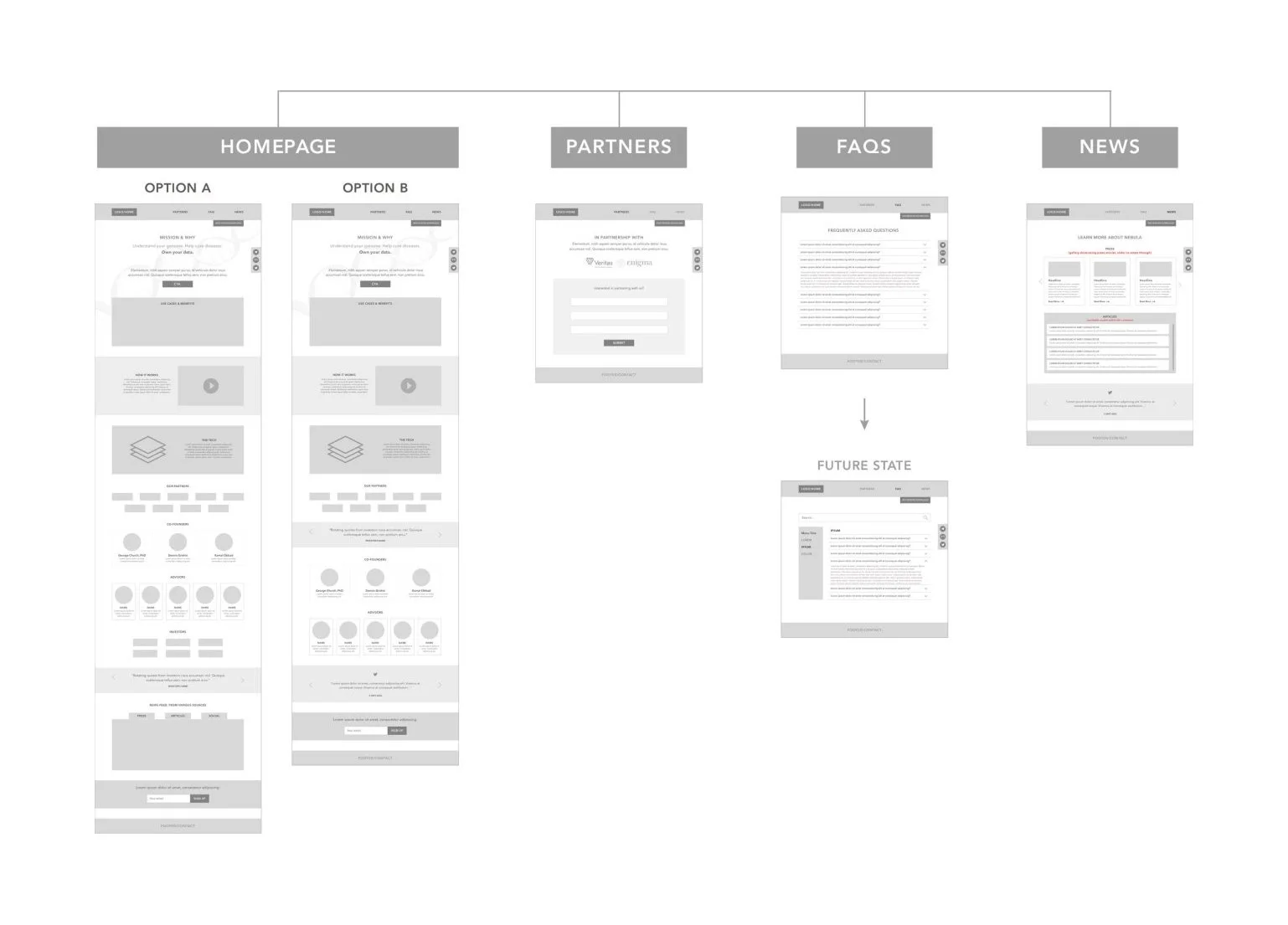
I began with low-fidelity wireframes to align with stakeholders on content hierarchy, page structure and the purpose of each section.
The wireframes were used to test whether the value proposition was clear above the fold, whether technical terminology appeared too early, whether the relationship between marketplace participants was understandable and whether calls to action appeared at the right moments.
Working in low fidelity made it easier to challenge content order and page proportions before becoming attached to the visual execution.
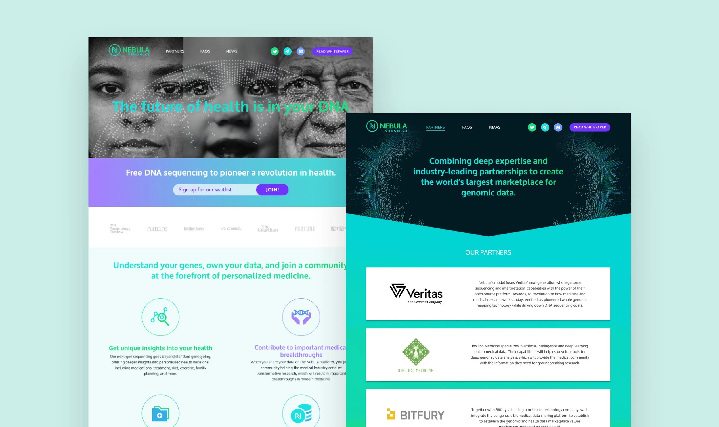
Once the narrative and structure were aligned, I translated the wireframes into high-fidelity responsive designs using the new identity system.
Responsive Website Experience
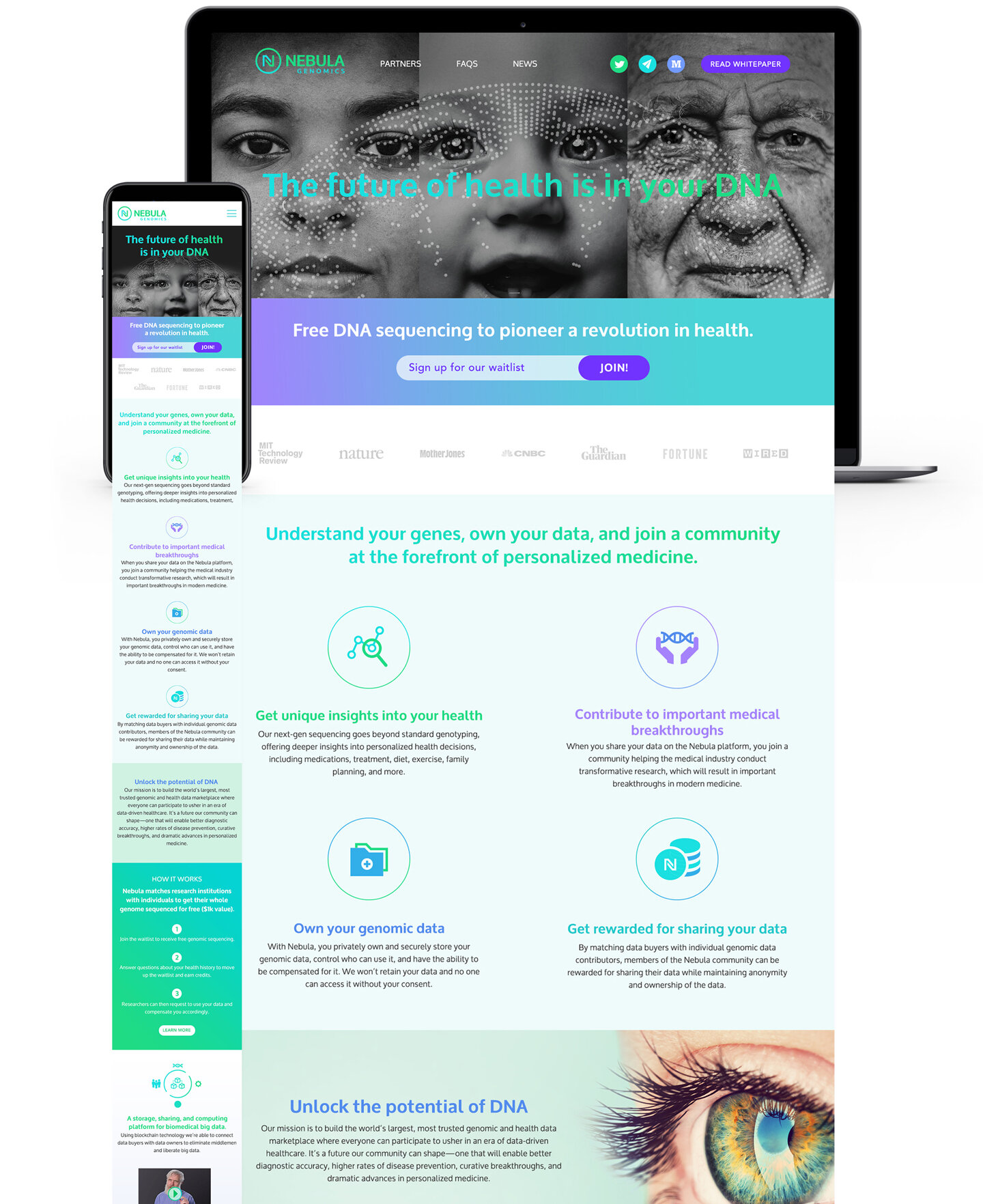
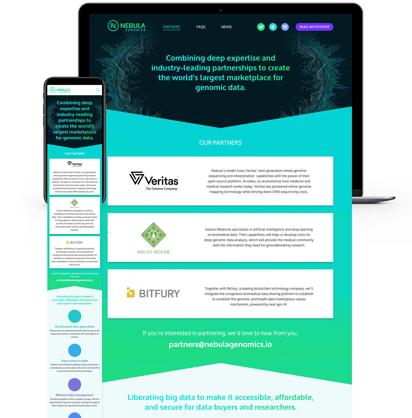
The final website introduced Nebula through a bold, future-focused identity while maintaining the clarity required to communicate a complex proposition.
The design combined concise messaging, visual explanations and modular sections to help visitors understand the relationship between genomic ownership, blockchain infrastructure and the wider marketplace.
The responsive system adapted the hierarchy across desktop, tablet and mobile rather than simply compressing the desktop layout. It included a clear introductory proposition, prominent waitlist actions, visual explanations of the marketplace, credibility indicators and flexible content modules.
The website launched in August 2018 and introduced the new identity across Nebula’s primary public-facing digital presence.
Scalability & Future Ecosystem Thinking
The website was designed as the first layer of a much larger digital ecosystem.
Although the immediate goal was to establish the brand, explain the proposition and support early waitlist acquisition, the company’s future vision included consumer accounts, developer resources, product demonstrations, researcher tools, partner portals and educational content.
This future direction influenced the modularity of the visual system and content architecture. The foundation needed to support new audiences and authenticated experiences without requiring the brand or website structure to be reinvented.
Impact
The engagement established a unified visual identity and responsive digital foundation for Nebula’s public launch.
The work gave the company a recognizable brand, translated a complex proposition into a more structured story and created a website that could support early awareness, waitlist participation and future expansion.
Because post-launch analytics were not available to the design team, the case study should not claim increases in conversion, trust or engagement. The strongest measurable outcome is the successful delivery and launch of the identity and responsive website, along with a scalable foundation for future products and audiences.
Reflection
The project reinforced the importance of treating brand, communication and digital experience as one connected system. The visual identity alone could not establish trust. Visitors also needed to understand why genomic ownership mattered how the ecosystem worked and what role they could play within it.
The engagement required balancing scientific credibility with accessibility, technological innovation with legitimacy and immediate launch needs with long-term platform ambitions.
With additional time, I would have introduced audience research and comprehension testing to evaluate how people interpret the marketplace model, genomic ownership and blockchain terminology, as well as which messages most effectively supported trust and participation.
The project gave Nebula a cohesive foundation for entering the market while identifying opportunities for deeper validation as the company and platform evolved.