Clarity Design System
Industry:
Retail, Beauty
2018-2019
Timeline:
Role:
Senior Product Designer
Responsibilities:
UX/UI Design
RODAN + FIELDS
Overview
Rodan + Fields was rapidly scaling across digital products, internal teams, and external vendors. As the ecosystem expanded, inconsistencies in UI patterns, workflows, accessibility standards, and implementation approaches began creating fragmentation across the user experience.
The initiative, named Clarity Design System by the Design Director, was created to establish a scalable foundation that unified product experiences, streamlined collaboration between design and engineering, and improved the speed and consistency of delivery across the organization.
As a Senior Product Designer, I helped define the system foundations, component architecture, accessibility standards, governance workflows, and adoption strategy that enabled teams to design and build more efficiently at scale.
Business Problem
As the organization grew, teams and vendors were often solving similar interface problems independently. Product experiences evolved in silos, resulting in duplicated work, inconsistent UI behaviors, fragmented visual patterns, and accessibility gaps across the ecosystem.
This created challenges across multiple areas:
Designers were repeatedly recreating common patterns instead of focusing on solving user problems.
Engineering teams lacked a consistent implementation reference.
Accessibility compliance varied between products.
Product experiences felt disconnected across platforms.
Design decisions became harder to scale and maintain over time.
The organization needed a shared system that could create alignment across teams while supporting long-term scalability.
Why a new Design System
The goal was not simply to create a UI library, but to build a scalable operational framework that connected design, engineering, and product teams around a shared language and set of standards.
The design system aimed to:
Establish a single source of truth for UI patterns and behaviors
Improve consistency across products and platforms
Reduce duplicated design and engineering effort
Accelerate design and development workflows
Improve accessibility compliance and usability (WCAG standards)
Create reusable foundations that could scale with the organization
Support onboarding and cross-functional collaboration
The system needed to function as a living product that continuously evolved alongside the company’s growing ecosystem.
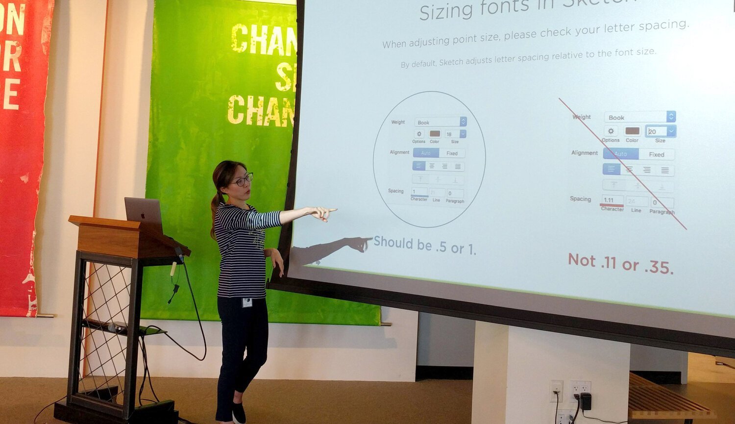
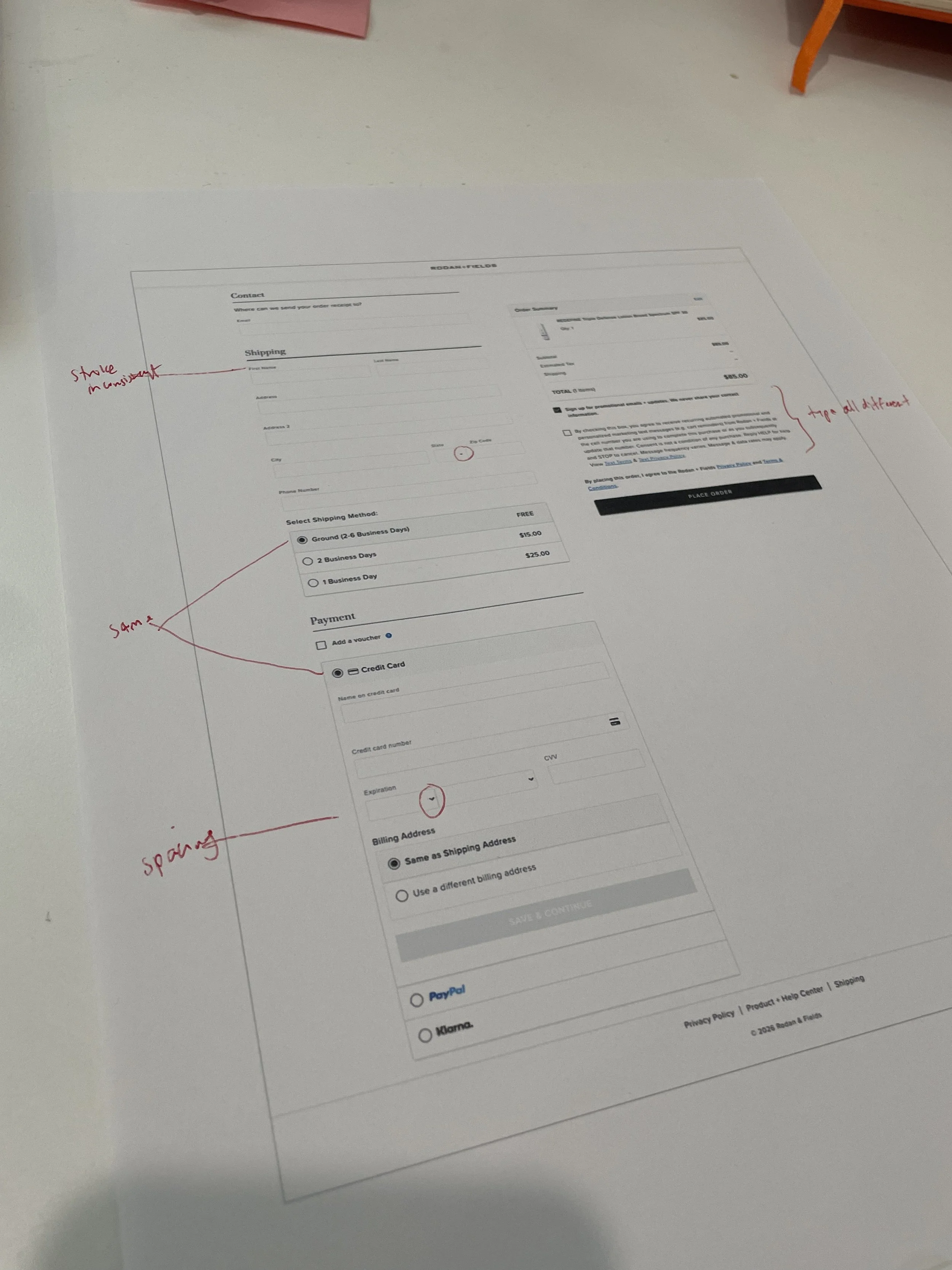
Audit of existing inconsistencies
Before defining the system, I evaluated the existing ecosystem to identify recurring inconsistencies and operational inefficiencies across products.
The audit revealed that multiple versions of similar components existed across teams, often with conflicting visual styles, spacing rules, and interaction behaviors. Buttons and form fields behaved inconsistently between products, while accessibility standards were not uniformly applied across experiences. Documentation and implementation guidance were also fragmented, which created inefficiencies for both design and engineering teams.
This evaluation helped prioritize where standardization would create the greatest impact and informed the foundational structure of the system.
Foundations + Tokens
To create a scalable foundation, the design system was structured using principles inspired by Brad Frost’s Atomic Design methodology. The process started by defining reusable tokens and foundational UI primitives before scaling upward into more complex components and templates.
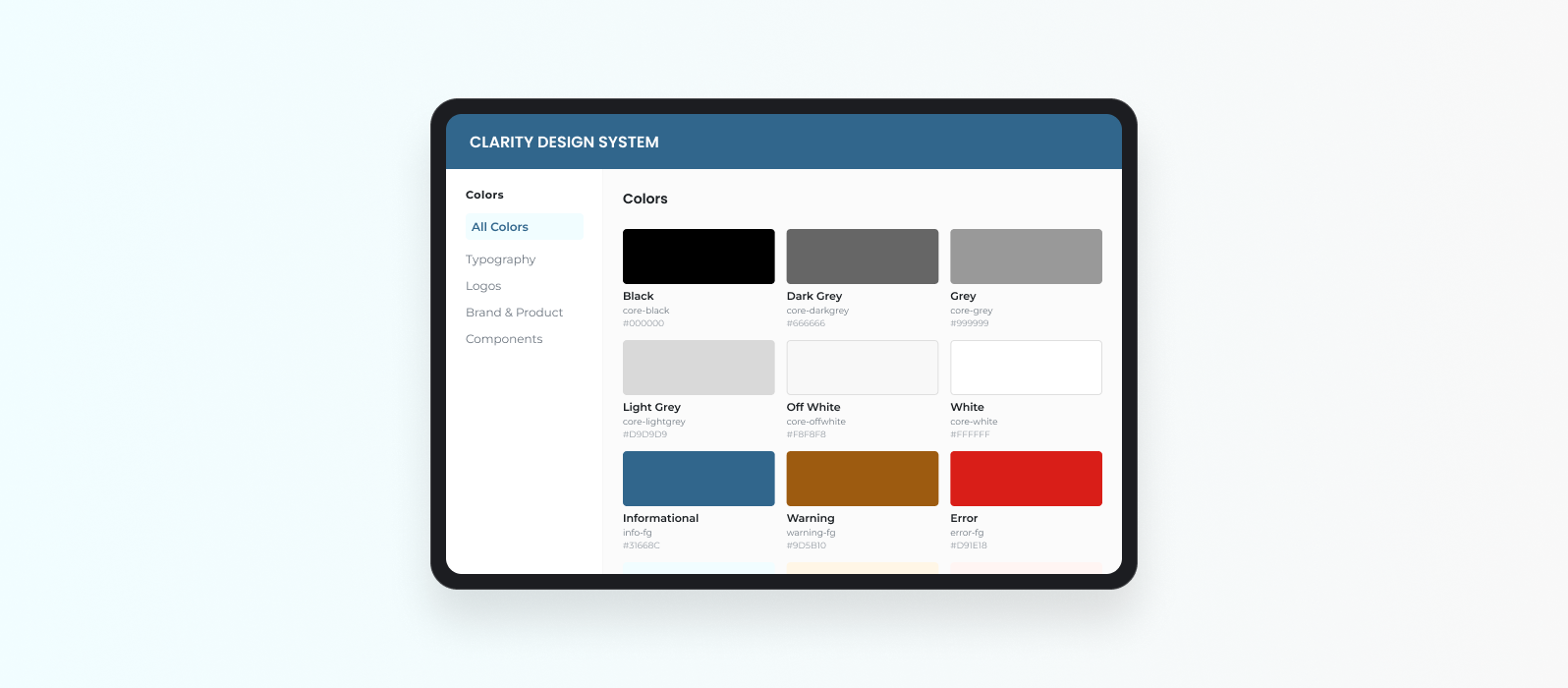
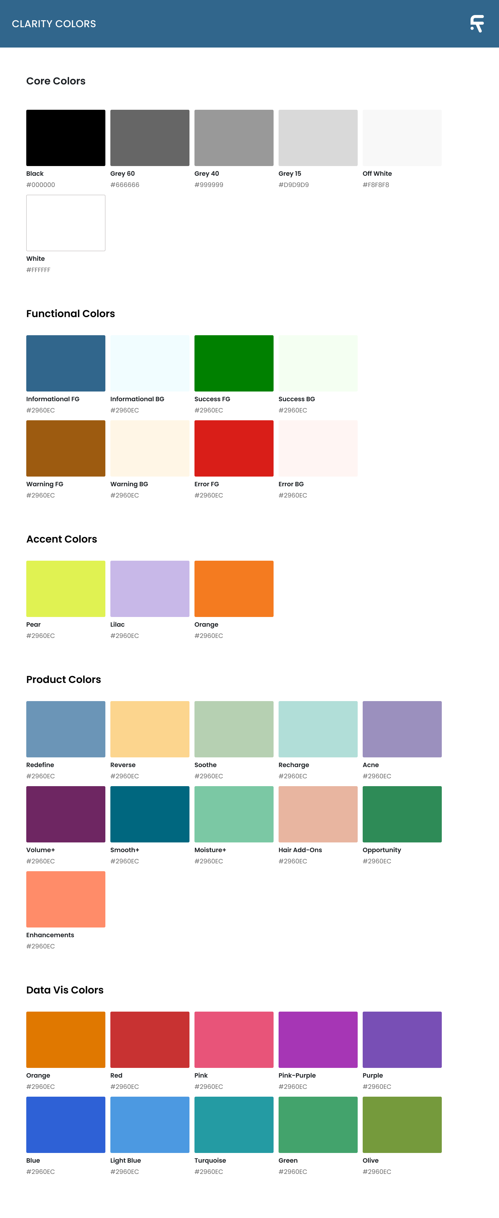
A neutral monochromatic palette was established to create consistency and flexibility across the ecosystem, while product-specific colors were intentionally used sparingly as accents to maintain hierarchy and reduce visual noise. Each color was assigned a semantic role within the interface system, including background surfaces, typography, dividers, interaction states, and status messaging.
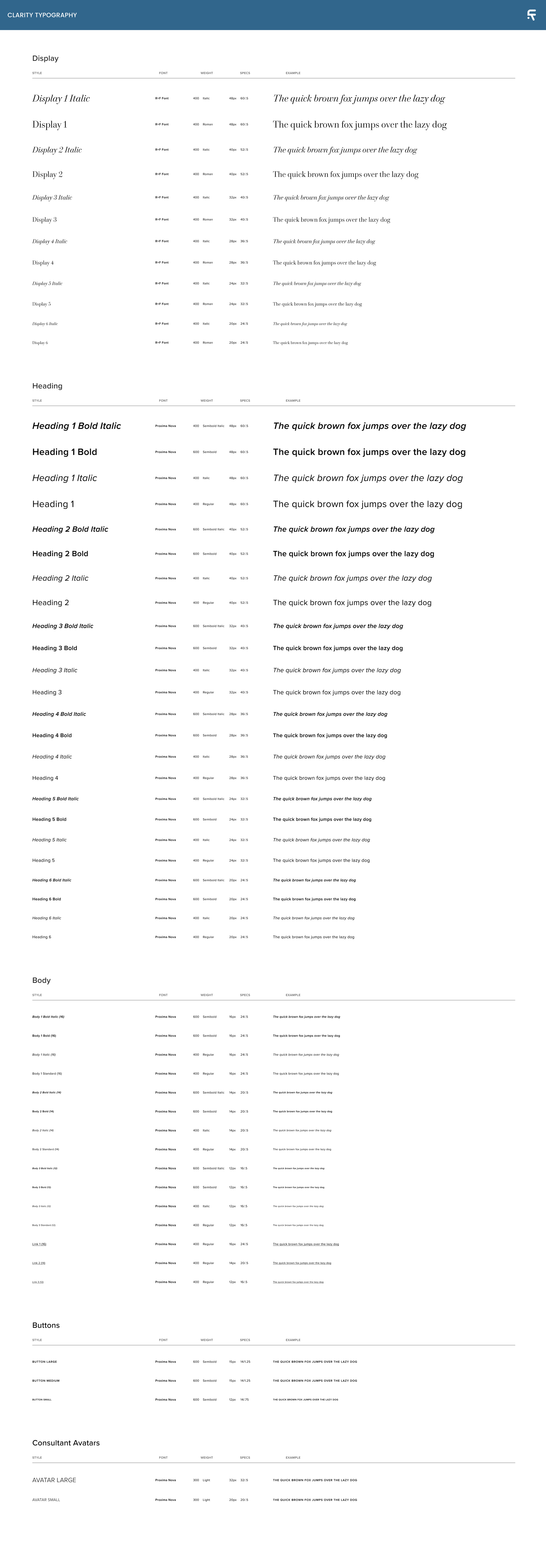
Typography standards were also unified across the ecosystem using two typefaces: R+F Font for branded display moments and Proxima Nova for interface readability and scalable hierarchy. Typography scales, spacing relationships, and usage guidelines were standardized to improve consistency across products.
To further reinforce alignment between design and engineering, an 8px grid system was implemented to standardize layout structure, spacing relationships, and component alignment throughout the ecosystem.
A11y
Accessibility was treated as a foundational requirement rather than a secondary consideration.
The system established standards aligned with WCAG Level AA guidelines to ensure components could scale consistently while supporting usability across a broad range of users and devices. Accessibility guidance included approved foreground and background pairings, contrast validation, typography hierarchy, focus states, form field usability, and semantic color usage.
These standards were embedded directly into the documentation and component guidelines so teams could make more informed implementation decisions throughout both design and development workflows.
Component Architecture
Once the foundational layer was established, reusable components were created to standardize recurring interaction patterns across the ecosystem.
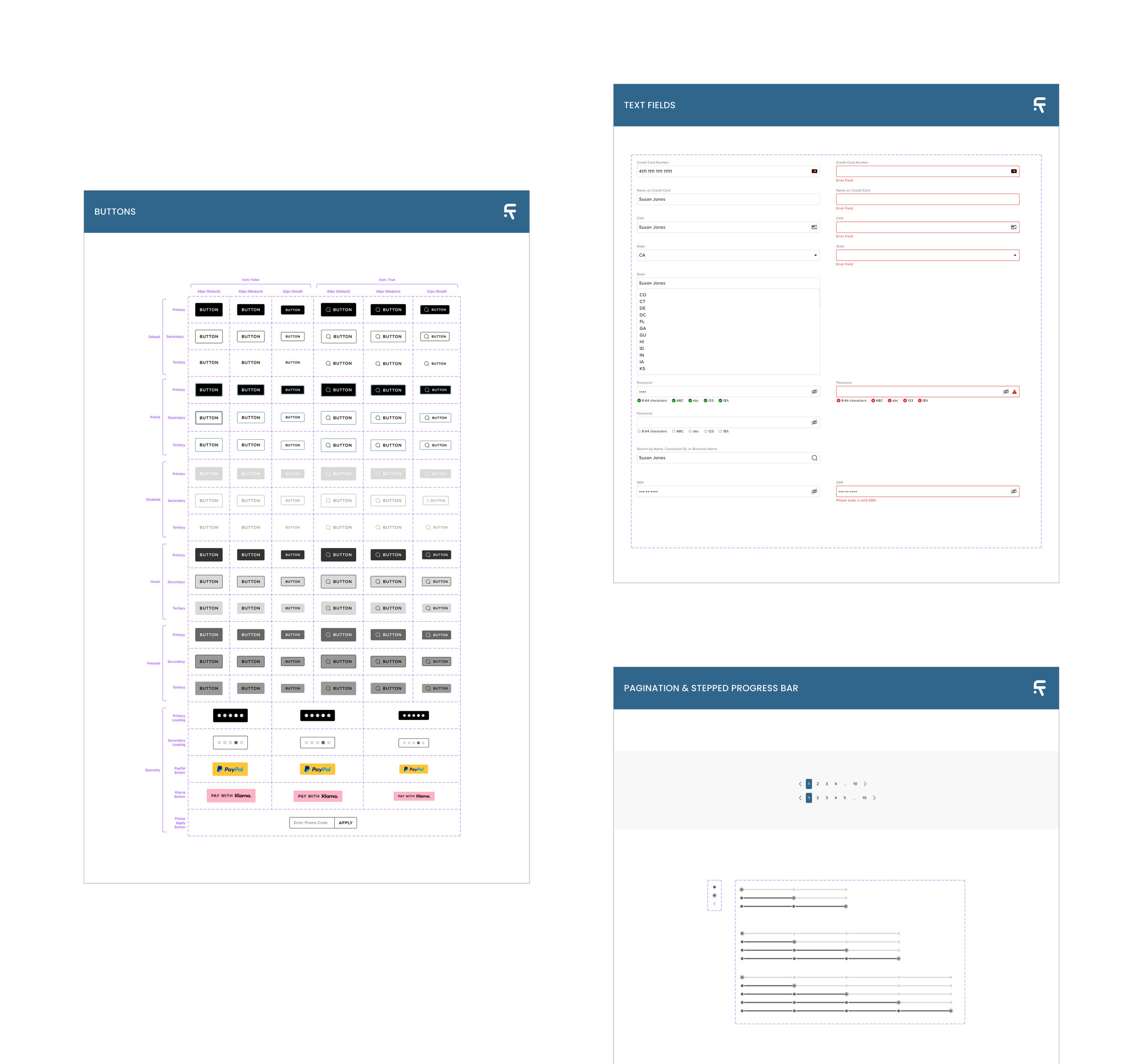
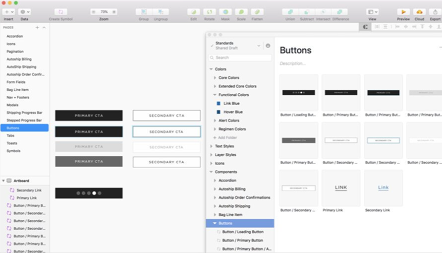
The component library included buttons, form fields, selection controls, pagination systems, progress indicators, navigation patterns, cards, and content containers. Each component was designed with multiple variants, interaction states, responsive considerations, accessibility behaviors, and implementation guidance to ensure consistency across products.
For example, button components included primary, secondary, and tertiary variants alongside hover, pressed, active, and disabled states. Icon and text combinations were also standardized to support different use cases while maintaining hierarchy and behavioral consistency.
The focus extended beyond visual alignment. The system was designed to create predictable interaction patterns and reusable structures that could scale efficiently across future products and features.
Templates & Product Integrations
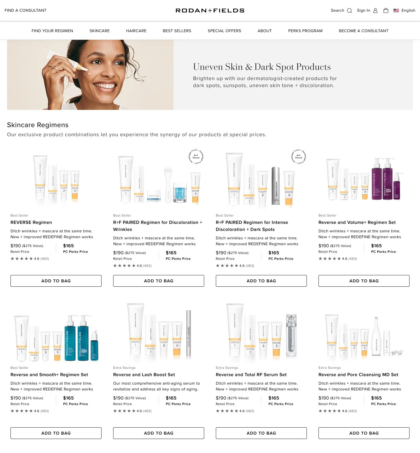
As the component library matured, components were combined into larger templates and page-level structures to validate how the system performed in real product scenarios.
This stage helped evaluate responsiveness, information hierarchy, layout scalability, and component flexibility using realistic content and workflows. Seeing the system applied within full experiences exposed opportunities to refine patterns, improve consistency, and strengthen usability across different contexts.
These templates also became an important bridge between design and engineering by helping teams understand how foundational components translated into complete product experiences.
Cross Functional Team
Building the design system required ongoing collaboration across design, product, and engineering teams.
Design critiques became a core part of the process to ensure new patterns and updates were collectively reviewed before being introduced into the system. These sessions helped pressure test scalability, validate responsive behaviors, reduce inconsistencies, and improve long-term maintainability across the ecosystem.
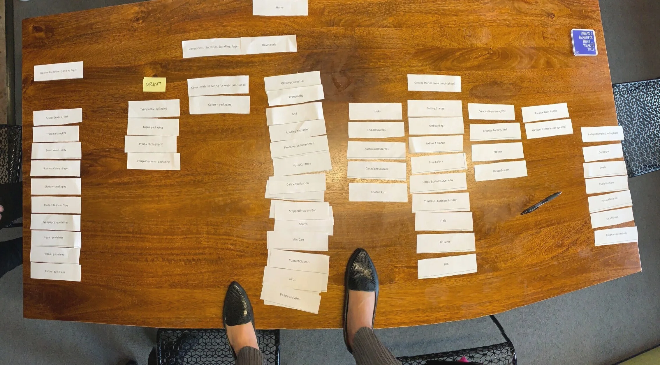
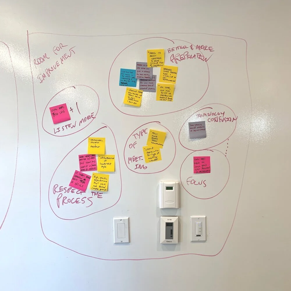
I also participated in defining the information architecture for the Clarity documentation website through collaborative card sorting workshops with the broader team. These exercises helped shape navigation structure, documentation priorities, and shared mental models around how the system should be organized and consumed internally.
Strong governance processes were essential to ensuring the system remained scalable as adoption increased across teams.
Adoption Rollout
Adoption played a critical role in the success of the design system.
Beyond building components, we focused heavily on helping teams confidently use and contribute to the system over time. This included maintaining a centralized Figma library, creating reusable developer references, publishing documentation and usage guidelines, hosting onboarding workshops, and communicating updates through regular release cadences.
The launch of the design system was treated as an organizational initiative designed to increase visibility, education, and cross-functional alignment around the new shared framework.
The objective was not only to ship a design system, but to encourage long-term adoption and establish a more consistent way of designing and building products across the company.
Impact
The Clarity Design System created a more unified and scalable foundation across the organization’s digital ecosystem.
The system reduced duplicated design effort, improved accessibility alignment, streamlined collaboration between design and engineering, and increased consistency across products. Designers were able to spend less time recreating UI patterns and more time focusing on solving user and business problems.
The design system also strengthened onboarding and operational efficiency by providing teams with reusable standards, documentation, and implementation guidance that could scale alongside the organization’s continued growth.