
Redesigning the Social Corner Tool
Industry:
Retail, Beauty
2024
Timeline:
Role:
Senior Product Designer
Responsibilities:
UX/UI Design
RODAN + FIELDS
Overview
With the consolidation of Comms Corner and R+F Social into a new “Social Corner,” this presented an opportunity not just to modernize the interface, but to rethink how consultants discover and act on content in fast, mobile-first contexts.
Problem
The existing Comms Corner experience was originally designed for desktop, but user behavior had significantly shifted, with over 94% of traffic now coming from mobile devices.
Despite this shift, the experience remained fragmented, visually outdated, and difficult to navigate on smaller screens. Consultants struggled to efficiently browse, locate, and act on content, often requiring multiple steps to preview and download assets.
As a result, the platform introduced friction at critical moments of intent, limiting adoption and reducing the likelihood that consultants would consistently use branded content in their social channels.
How can we improve an existing tool to increase user engagement?
Key Insights
Through collaboration with the research team and analysis of user behavior, three key patterns emerged:
Task-driven usage: Consultants access the tool with a clear intent (e.g., find content quickly to post), not to browse casually
Low tolerance for friction: Multi-step flows and hidden actions led to drop-off before completion
Content overload without structure: Lack of filtering and organization made discovery inefficient and overwhelming
These insights highlighted that improving visual design alone would not be sufficient. The experience needed to be restructured to support speed, clarity, and immediate action.
Design Goal
Design a mobile-first content distribution experience that enables consultants to quickly discover, evaluate, and act on branded assets, ultimately increasing engagement, adoption, and downstream social content usage.
Understanding the User
This project was informed by existing research conducted with consultants, including behavioral data, interviews and usage patterns. Consultants operate as independent sellers who rely on social platforms to promote products. Their interaction with Social Corner is typically quick, fast, and task oriented and mobile first, often occurring between their activities.
Key needs:
Quickly find relevant and ready to use content
Minimize effort required to download or share assets
Confidence that content aligns with brand standard
This context emphasizes the importance of designing for speed, clarity and low cognitive load, rather than exploratory browsing.
Competitive Analysis
The main offerings are 6 different regimens that each target a different skin concern. It is recommended by the founders to use this as a set as the ingredients were formulated to be applied to the skin in the right order so that each step effectively builds on the last.
Took a deeper dive into our product portfolio and classified the different types of products into the following categories. a deeper dive into our product portfolio and classified the different types of products into the following categories.
Design: Mobile First
The new experience is optimized to increase user engagement as it’s more intuitive and user friendly to navigate.
Updates:
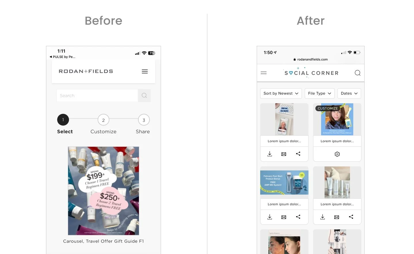
Branded “Social Corner” and have updated in the top navigation.
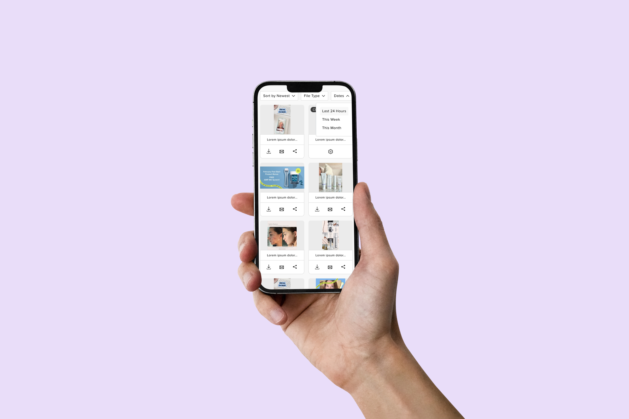
Top navigation is full width with logo centered to accommodate for hamburger menu on left and search on right.
Search feature has been added to the top navigation so it’s easily accessible at all times as the navigation has also been updated to be sticky on scroll.
Cards have been resized to fit 2 in a row on mobile so user can browse more content at a time while not compromising the thumbnail view.
Each card has download, email, and share feature at this browse level so user can easily take action here instead of having to click into each one.
Updates:
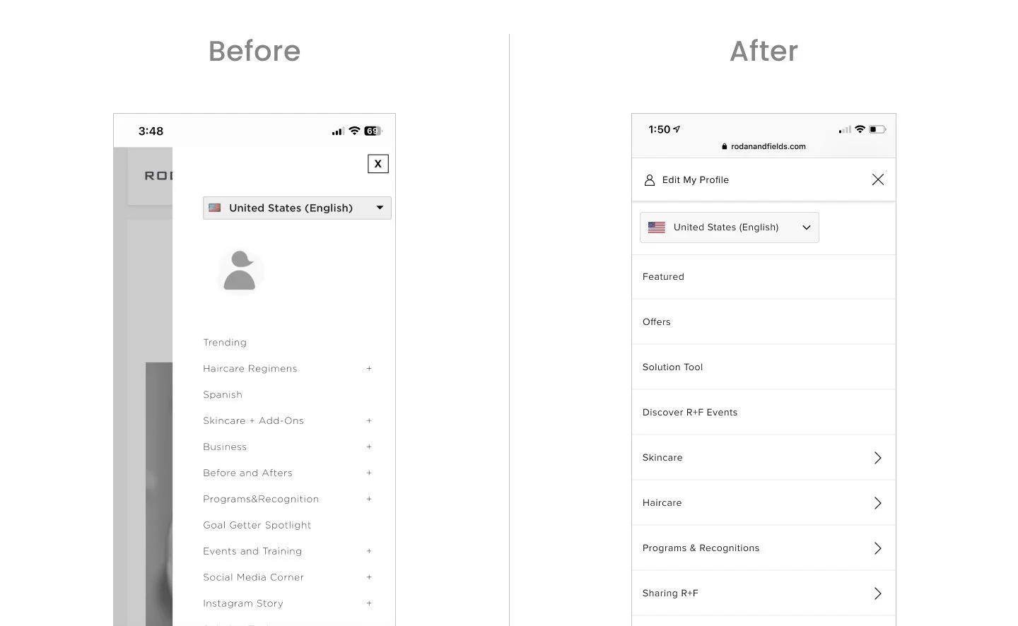
“Edit My Profile” is shown along with icon and visible at top so that it is clear to user where it will take them when they click on it.
Modernized the look & feel of the nav to align with our storefront experience. Full overlay and have updated the fonts to align with the latest in our design system.
Updates:
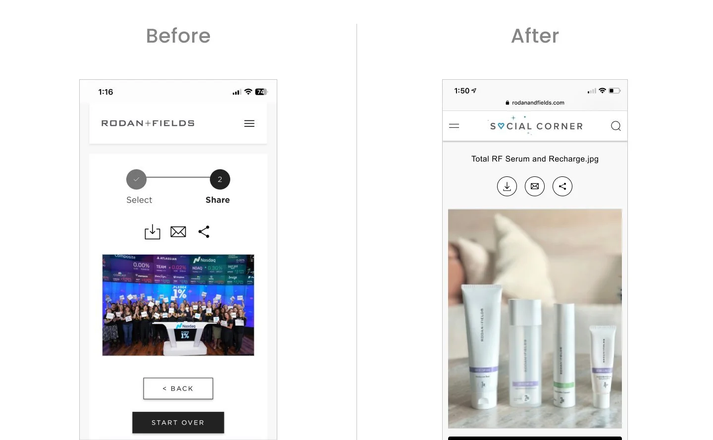
Added affordance for name of file at top as some users search specifically for a file and this is referenced.
Made the icons look prominent and more actionable by adding stroke and circle around it.
Removed the “Select” & “Share” progress bar as it took up prime real estate and didn’t add much value for users.
Updates:
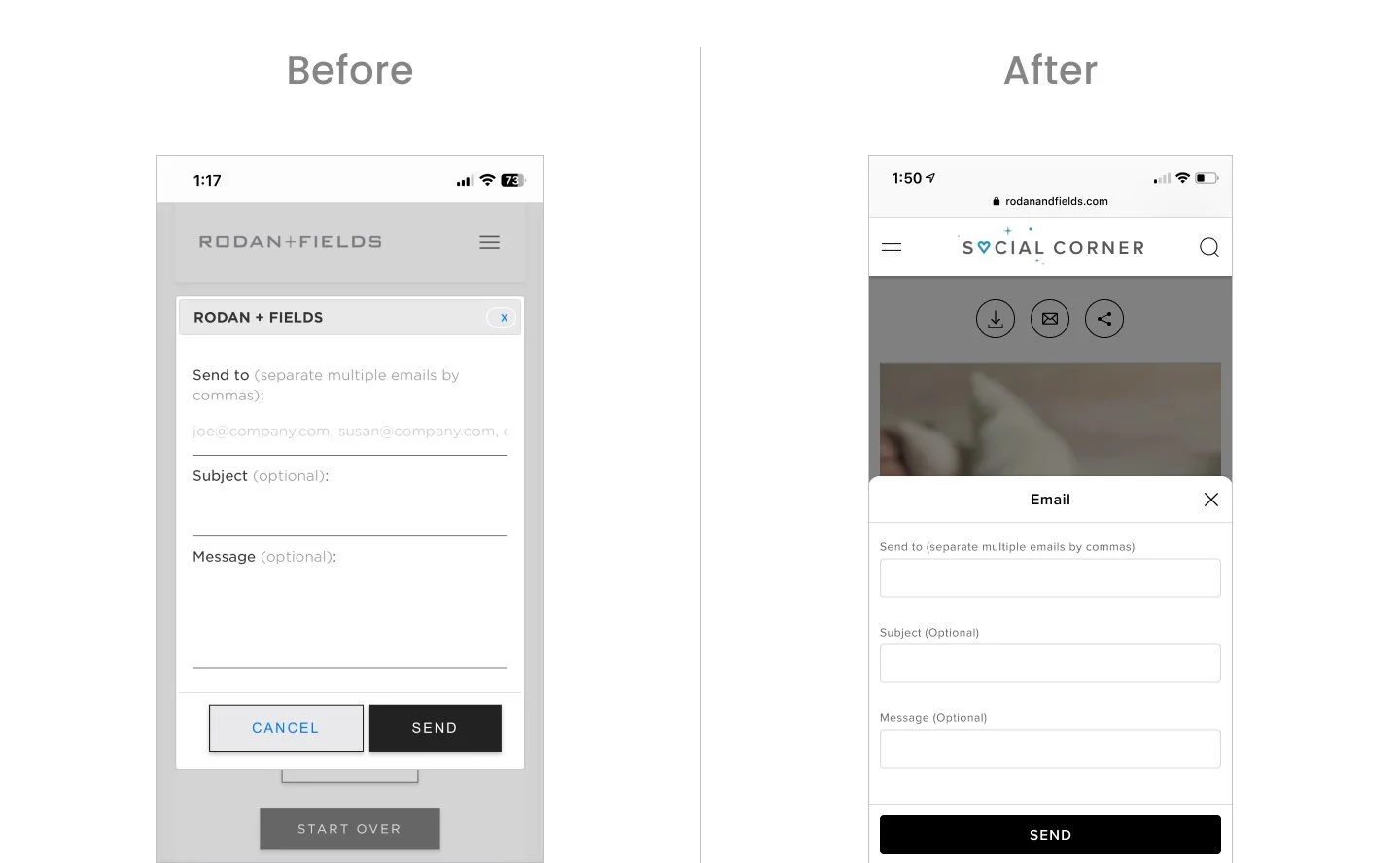
Updated old traditional modal to a bottom sheet style
Updated form fields to align with our latest style
Removed “Cancel” CTA as we have the close icon
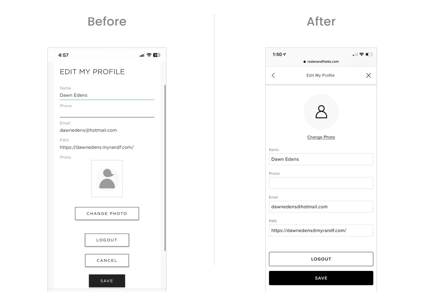
Updates:
Moved “Change Photo” to be at top, changed button to be a link as this is not the primary action on page. Updated default icon to be aligned to our icon style.
Updated form fields to be aligned to latest style.
Removed “Cancel” CTA as we have the close icon in the modal.
“Save” & “Logout” buttons are stacked and full width
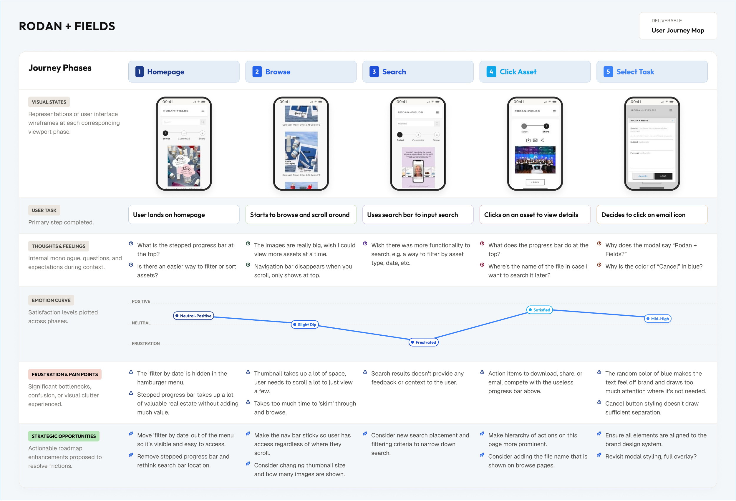
Iterations + Testing
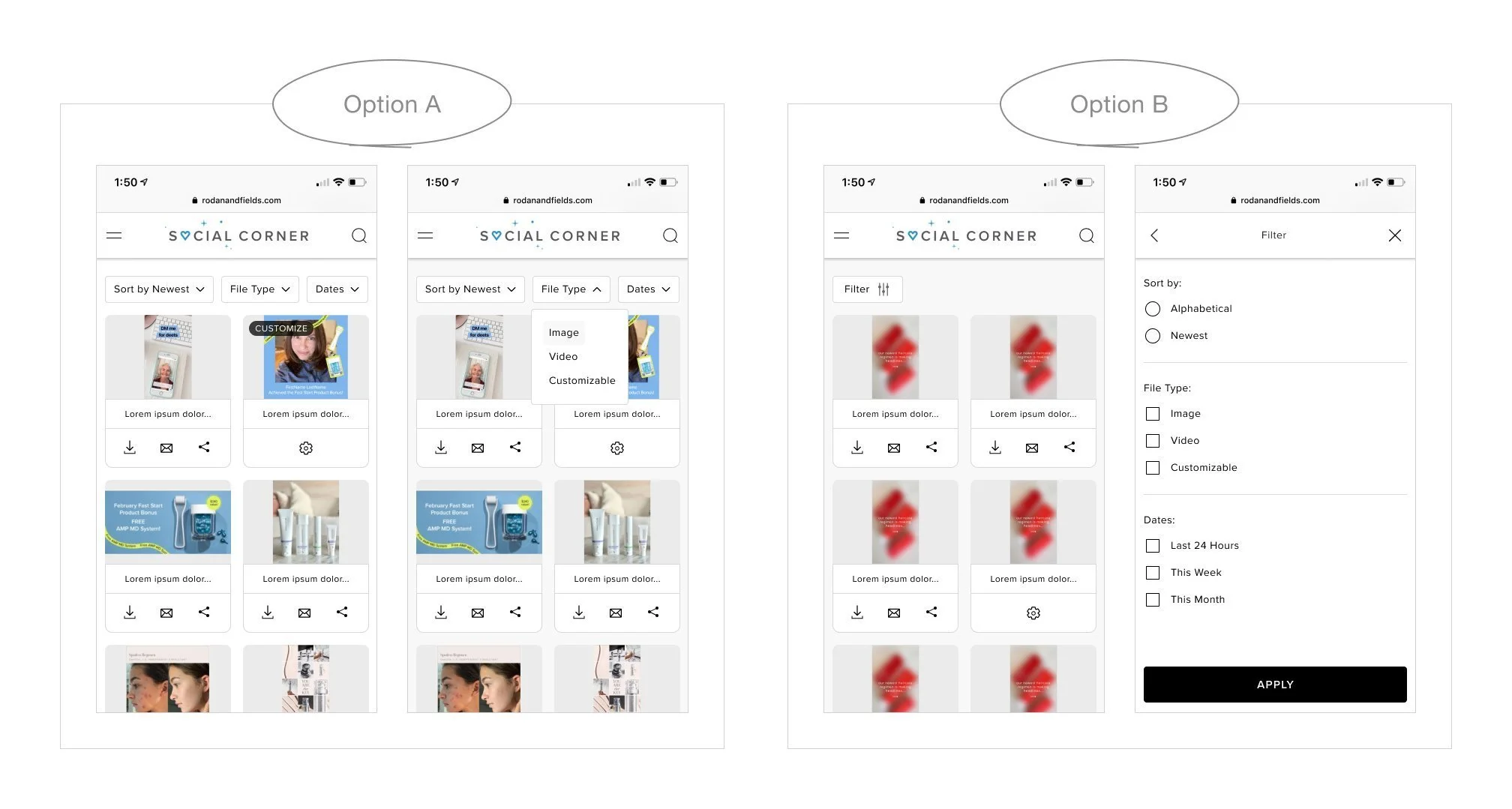
I explored 2 options for showcasing ways to sort and filter. The one on the left shows 3 different filtering options surfaced next to each other so user can click individually make their selection. The one on the right shows one filter button that opens up a modal with all their selection options which they can then apply.
Results
Filter Design
4 out of 6 users preferred Option A
Although Option A resulted in a more compact layout, it reduced interaction cost by eliminating an extra step. Users preferred having options immediately visible and accessible, suggesting that clarity and efficiency were prioritized over the additional white space and nested structure presented in Option B.
Card Component Design
Results
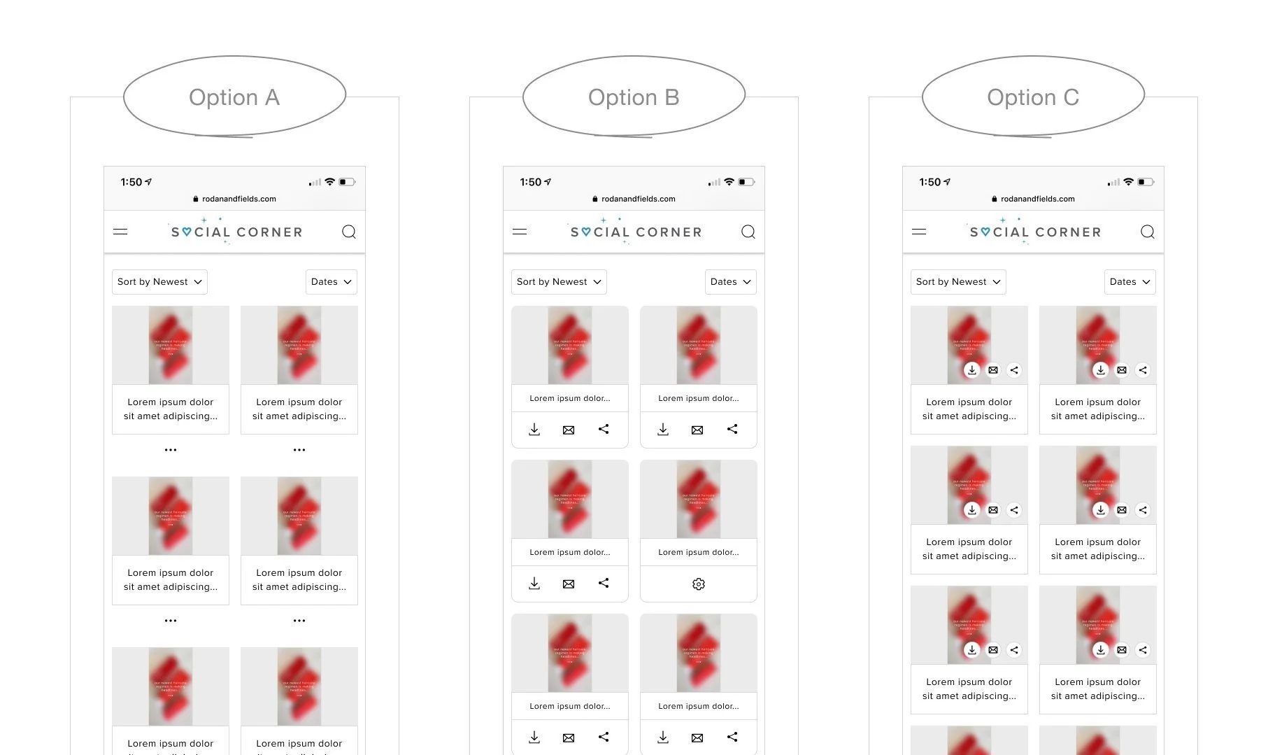
Option A was selected as the final direction.
While it introduces an additional interaction, it maintains a cleaner and more focused card layout by reducing visual noise and keeping secondary actions hidden until needed.
In contrast, Option B, which surfaces all actions directly on the card, increases visual density and competes with primary content. The repeated icons across every card create cognitive overload, making it harder for users to scan and focus on the content itself.
Option C, which overlays actions on the image, reduces available space and introduces visibility issues. The icons compete with the image content and risk being overlooked, particularly in dense grids where quick scanning is critical.
By grouping secondary actions under a single entry point, Option A leverages progressive disclosure to balance clarity and accessibility, prioritizing content visibility while still allowing users to access actions when needed.
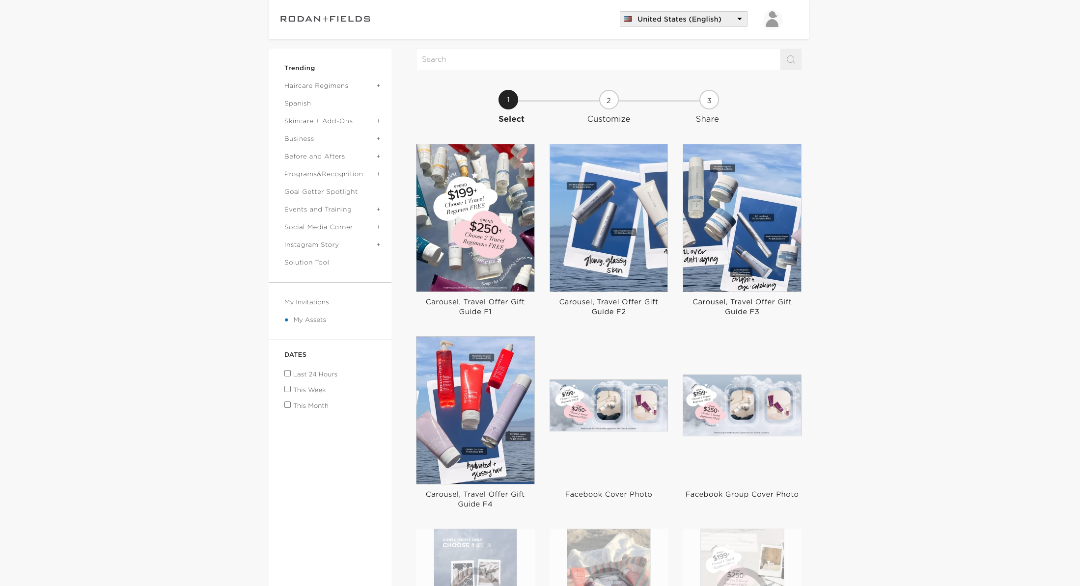
Desktop Experience
Before Redesign
After Redesign
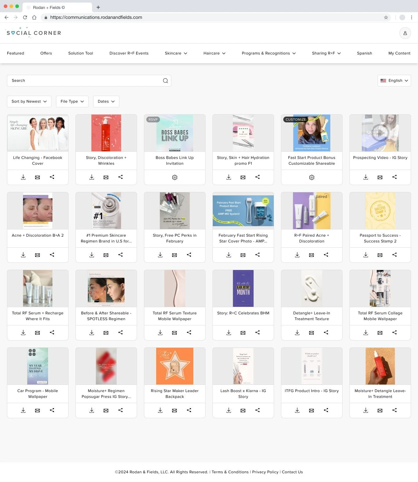
Results
Improved navigation accessibility
Replaced the static left navigation with a sticky top navigation, which ensures key actions and sections remain accessible without requiring users to scroll back, supporting more efficient navigation across large asset sets.
Optimized layout for scalability and screen utilization
Transitioned from a fixed-width layout to a fluid grid, that allows the interface to better adapt to different screen sizes and maximize available real estate, particularly important for content-heavy repositories.
Increased information density and scanability
Reduced card size to surface more assets within a single view, which results in faster visual scanning and comparison. This is especially valuable for repeat users who need to quickly identify relevant content.
Reduced interaction cost for key actions
Introduced download, email, and share actions directly on each card, eliminating the need to navigate into detail views. This supports faster task completion and aligns with high-frequency usage patterns.
Enhanced content discoverability
Added sorting and filtering capabilities, allowing users to quickly narrow down assets based on relevance, improving efficiency in content-heavy workflows.